ShopDreamUp AI ArtDreamUp
Deviation Actions


Suggested Deviants


Suggested Collections


![[OP OC] Karli`s profile](https://images-wixmp-ed30a86b8c4ca887773594c2.wixmp.com/f/9168ccd4-d27b-4035-bf21-d30703c0d510/db8nnc0-34f60171-d9c4-42cb-afbb-b92fe3bedf43.png/v1/crop/w_184,h_184,x_24,y_0,scl_0.046/_op_oc__karli_s_profile_by_luchi26_db8nnc0-92s-2x.png?token=eyJ0eXAiOiJKV1QiLCJhbGciOiJIUzI1NiJ9.eyJzdWIiOiJ1cm46YXBwOjdlMGQxODg5ODIyNjQzNzNhNWYwZDQxNWVhMGQyNmUwIiwiaXNzIjoidXJuOmFwcDo3ZTBkMTg4OTgyMjY0MzczYTVmMGQ0MTVlYTBkMjZlMCIsIm9iaiI6W1t7ImhlaWdodCI6Ijw9MTA1MCIsInBhdGgiOiJcL2ZcLzkxNjhjY2Q0LWQyN2ItNDAzNS1iZjIxLWQzMDcwM2MwZDUxMFwvZGI4bm5jMC0zNGY2MDE3MS1kOWM0LTQyY2ItYWZiYi1iOTJmZTNiZWRmNDMucG5nIiwid2lkdGgiOiI8PTE2MDAifV1dLCJhdWQiOlsidXJuOnNlcnZpY2U6aW1hZ2Uub3BlcmF0aW9ucyJdfQ.itH32wc7yysbLehiGGUs1PIYb9cn-8i2YdDp0Tv8Cg8)
![[OP OC] Karli`s profile](https://images-wixmp-ed30a86b8c4ca887773594c2.wixmp.com/f/9168ccd4-d27b-4035-bf21-d30703c0d510/db8nnc0-34f60171-d9c4-42cb-afbb-b92fe3bedf43.png/v1/crop/w_92,h_92,x_12,y_0,scl_0.023/_op_oc__karli_s_profile_by_luchi26_db8nnc0-92s.png?token=eyJ0eXAiOiJKV1QiLCJhbGciOiJIUzI1NiJ9.eyJzdWIiOiJ1cm46YXBwOjdlMGQxODg5ODIyNjQzNzNhNWYwZDQxNWVhMGQyNmUwIiwiaXNzIjoidXJuOmFwcDo3ZTBkMTg4OTgyMjY0MzczYTVmMGQ0MTVlYTBkMjZlMCIsIm9iaiI6W1t7ImhlaWdodCI6Ijw9MTA1MCIsInBhdGgiOiJcL2ZcLzkxNjhjY2Q0LWQyN2ItNDAzNS1iZjIxLWQzMDcwM2MwZDUxMFwvZGI4bm5jMC0zNGY2MDE3MS1kOWM0LTQyY2ItYWZiYi1iOTJmZTNiZWRmNDMucG5nIiwid2lkdGgiOiI8PTE2MDAifV1dLCJhdWQiOlsidXJuOnNlcnZpY2U6aW1hZ2Uub3BlcmF0aW9ucyJdfQ.itH32wc7yysbLehiGGUs1PIYb9cn-8i2YdDp0Tv8Cg8)


You Might Like…


Featured in Groups


Description
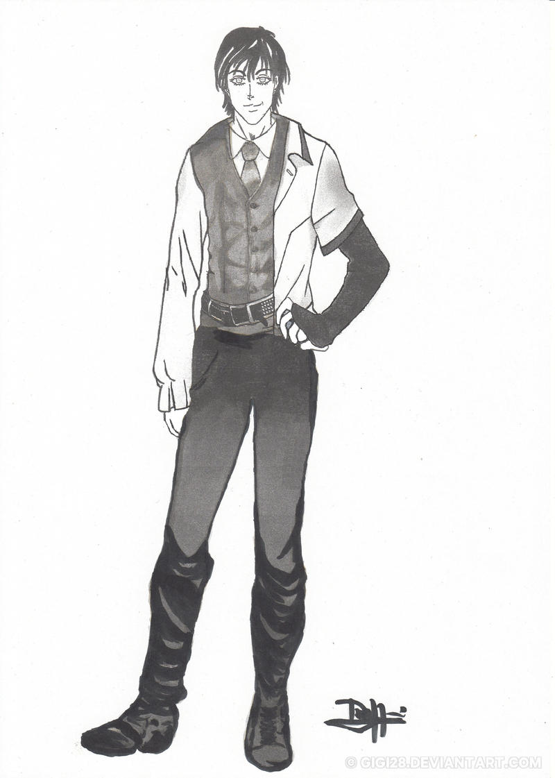
hi,
This is one of my OCs . I created myself these clothes and I find the result quite cool ^^
 Any suggestions on how to liven up the character are welcome. Also, any advice on anatomy is welcome. Red-lines are appreciated. I feel like there is no effect of shadow with this kind of clothes so if someone could show me with red-lines how to fix it that will be really kind ...


This is one of my OCs . I created myself these clothes and I find the result quite cool ^^
Any suggestions on how to liven up the character are welcome. Also, any advice on anatomy is welcome. Red-lines are appreciated. I feel like there is no effect of shadow with this kind of clothes so if someone could show me with red-lines how to fix it that will be really kind ... Image size
2496x3496px 1.92 MB
Make
Canon
Model
CanoScan LiDE 110
Date Taken
Oct 11, 2016, 10:33:57 AM
© 2016 - 2024 gigi28
Comments9
Join the community to add your comment. Already a deviant? Log In
Very nice drawing! I allways think it's so difficult to develope one's own characters, so great work!
I think there is nothing actually wrong with the proportions, meaning to say, that there could be a person proportioned just the way he is. There are a few things that are "not average" about him. This is of course part of the personality you give him, so if you did those intentionally, you shouldn't change a thing:
- The hands are very large in proportion to his face. My thumb-rule is, one hand is as large as half a face.
- In proportion to his height he has rather slim shoulders
- In proportion to his overall height he has very long legs and a rather short upper body
- The eyes are very large, especially for a men and give him a slight feminine touch.
All in all, I think this is a great drawing. I think you do need more shading however, currently this is a mixture between line-art (especially on his shirt) and more detailed shading (like on his waste coat). If you used the kind of shading you did on the waste coat more consistently, I think this would help give the drawing more depth.